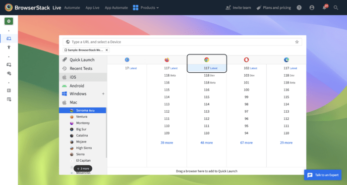
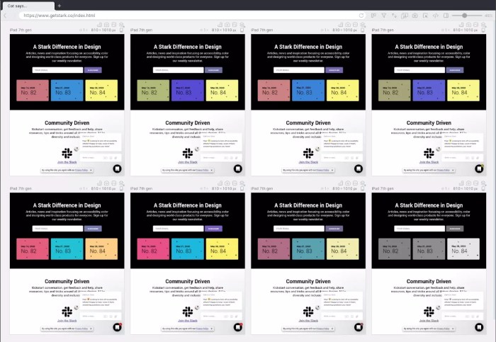
Ensuring your website functions flawlessly across different browsers is crucial for a positive user experience. Inconsistencies in rendering, JavaScript execution, and responsiveness across varying screen sizes are common headaches for web developers. This guide tackles three prevalent browser compatibility issues, providing practical solutions and best practices to create a seamless experience for all visitors, regardless of their chosen browser or device.
We’ll explore the root causes of these problems, from CSS discrepancies and JavaScript engine differences to the challenges of responsive design. Through detailed explanations, practical examples, and step-by-step instructions, you’ll learn how to identify, debug, and prevent these issues, resulting in a more robust and user-friendly website.
Inconsistent Rendering Across Browsers

Website rendering inconsistencies across different browsers are a common headache for web developers. These discrepancies, often subtle but sometimes jarring, stem from variations in how browsers interpret and render Cascading Style Sheets (CSS) and handle different aspects of HTML. Understanding the root causes and employing effective debugging techniques is crucial for ensuring a consistent user experience across platforms.
Visual inconsistencies primarily arise from differences in browser rendering engines and how they interpret CSS properties. Each major browser (Chrome, Firefox, Safari, Edge, etc.) utilizes its own rendering engine, leading to slight variations in how elements are displayed. Furthermore, CSS itself can introduce inconsistencies. Certain properties, particularly those related to box-sizing, flexbox, and older, less-standardized properties, are notoriously prone to browser-specific interpretations. For example, the `box-sizing` property, which controls how the width and height of an element are calculated, might render differently in older versions of Internet Explorer compared to modern browsers. Similarly, subtle differences in how browsers handle floating elements or the `position` property can lead to unexpected layout shifts. Another frequent source of issues is the use of vendor prefixes (e.g., `-webkit-`, `-moz-`, `-ms-`) which were necessary for supporting older browser versions but can lead to inconsistencies if not handled properly.
Identifying and Debugging Rendering Inconsistencies
Browser developer tools are invaluable for pinpointing and resolving rendering discrepancies. These tools allow for detailed inspection of the rendered HTML and CSS, enabling a direct comparison across different browsers. The process generally involves the following steps:
First, open your website in the browsers you want to compare (Chrome, Firefox, Safari). Then, open the developer tools in each browser (usually by pressing F12). Use the “Elements” or “Inspector” panel to select the element exhibiting inconsistent rendering. The “Styles” pane will display the computed styles applied to that element. Carefully compare the computed styles across browsers. Pay close attention to differences in values for properties like `box-sizing`, `margin`, `padding`, `width`, `height`, `display`, `float`, and `position`. If you identify conflicting styles, examine the CSS rules to determine their origin (e.g., inline styles, internal stylesheets, external stylesheets). You can use the “Sources” panel to locate and modify the relevant CSS file. This allows for real-time testing and immediate visual feedback on changes made.
Designing a Cross-Browser Compatible CSS Framework
A well-structured CSS framework can significantly minimize browser-specific rendering issues. This involves using techniques like normalization and cross-browser compatible selectors.
Normalization aims to standardize the default styles of HTML elements across different browsers. This ensures a consistent baseline for styling. Popular normalization stylesheets, like Normalize.css, provide a robust foundation. Furthermore, using modern CSS techniques like flexbox and grid layouts minimizes the need for browser-specific hacks. These modern layout methods are consistently supported across modern browsers, offering cleaner and more maintainable code.
CSS Property Compatibility Across Browsers
The following table illustrates the compatibility of several common CSS properties across major browsers. Note that browser versions significantly impact actual behavior; this table shows general trends for current versions. Testing on specific target browsers is always recommended.
| Browser | Property | Expected Behavior | Actual Behavior (General Trend) |
|---|---|---|---|
| Chrome | box-sizing: border-box; | Width and height include padding and border. | Consistent across versions. |
| Firefox | box-sizing: border-box; | Width and height include padding and border. | Consistent across versions. |
| Safari | box-sizing: border-box; | Width and height include padding and border. | Consistent across versions. |
| Chrome | display: flex; | Enables flexible box layout. | Consistent and widely supported. |
| Firefox | display: flex; | Enables flexible box layout. | Consistent and widely supported. |
| Safari | display: flex; | Enables flexible box layout. | Consistent and widely supported. |
| Chrome | filter: blur(5px); | Applies a Gaussian blur effect. | Generally consistent, minor variations possible in older versions. |
| Firefox | filter: blur(5px); | Applies a Gaussian blur effect. | Generally consistent, minor variations possible in older versions. |
| Safari | filter: blur(5px); | Applies a Gaussian blur effect. | Generally consistent, minor variations possible in older versions. |
Javascript Compatibility Issues

JavaScript, while a cornerstone of modern web development, presents a significant challenge in ensuring consistent functionality across different browsers. This stems from variations in how browsers’ JavaScript engines (the programs that execute JavaScript code) interpret and handle the language. These differences can manifest as subtle inconsistencies or outright failures, leading to frustrating user experiences and website malfunctions.
JavaScript engines, such as V8 (Chrome), SpiderMonkey (Firefox), and JavaScriptCore (Safari), are independently developed and updated, resulting in variations in their feature support and implementation details. A script that functions flawlessly in one browser might encounter errors or produce unexpected results in another. These discrepancies often relate to the availability of specific JavaScript APIs (Application Programming Interfaces), differences in how they are implemented, and even subtle variations in the parsing of the code itself. This complexity necessitates careful planning and implementation to ensure cross-browser compatibility.
Common JavaScript Errors and Browser-Specific Manifestations
Several common JavaScript errors demonstrate the challenges of cross-browser compatibility. For example, the use of certain newer JavaScript features (like arrow functions or the `let` and `const` s) may not be supported in older browser versions. Consider this code snippet:
let x = 10;

const y = 20;

let sum = (a, b) => a + b;

console.log(sum(x, y));
This code, while perfectly valid in modern browsers, might fail in older browsers that don’t support arrow functions or the `let` and `const` s. Older browsers might throw syntax errors or produce unexpected results. Similarly, inconsistencies can arise from differences in how browsers handle event handling, particularly when dealing with cross-browser event propagation. A script relying on a specific event order might behave differently in various browsers, leading to unexpected behavior or even crashes. Another common issue is the varying support for different DOM (Document Object Model) methods across different browsers and versions. A piece of code that manipulates the DOM in a specific way in one browser may produce a different result or error in another.
Ensuring Consistent JavaScript Functionality
To address these challenges and ensure consistent JavaScript functionality across browsers, a two-pronged approach using feature detection and polyfills is recommended.
Feature detection involves checking if a specific feature or API is supported by the browser before attempting to use it. This avoids errors caused by attempting to use unsupported features. Polyfills, on the other hand, provide backward compatibility for newer features. They are essentially pieces of code that emulate the functionality of newer APIs in older browsers that lack native support.
Here’s a step-by-step guide:
- Step 1: Identify Potential Compatibility Issues: Thoroughly test your JavaScript code in various browsers (Chrome, Firefox, Safari, Edge) and identify any inconsistencies or errors.
- Step 2: Implement Feature Detection: Use JavaScript’s `typeof` operator, `in` operator, or feature detection libraries like Modernizr to check if a specific feature is available before using it. For example, to check for support of the `forEach` method on arrays:
if (Array.prototype.forEach)

  myArray.forEach(function(item)  /* Your code here */ );

 else

// Provide a fallback implementation for older browsers - Step 3: Utilize Polyfills: If a feature is not supported, use a polyfill to add that functionality. Many popular JavaScript libraries and frameworks include polyfills, or you can find them on sites like Polyfill.io. Include these polyfills in your project to ensure compatibility.
- Step 4: Thorough Testing: After implementing feature detection and polyfills, conduct comprehensive cross-browser testing to verify that your JavaScript code functions correctly across all target browsers and devices.
By systematically applying feature detection and polyfills, developers can mitigate the risks associated with JavaScript compatibility issues, ensuring a more consistent and reliable user experience across all major browsers.
Handling Different Screen Sizes and Resolutions

Creating websites that seamlessly adapt to various screen sizes and resolutions is crucial for providing a consistent and positive user experience across all devices. Failing to do so can lead to poor readability, frustrating navigation, and ultimately, lost users. This section will explore effective techniques for ensuring your website looks great on everything from large desktop monitors to small mobile phones.
Responsive web design is the cornerstone of creating websites that adapt to different screen sizes. This involves using techniques that allow the website layout to adjust dynamically based on the viewport dimensions. This contrasts sharply with older methods that required creating separate websites or versions for different devices, a significantly less efficient and maintainable approach.
Responsive Web Design Techniques
Several key techniques contribute to responsive design. Fluid grids, which use percentage-based widths rather than fixed pixel widths, allow elements to scale proportionally with the screen size. Media queries, a cornerstone of responsive design, apply CSS styles based on device characteristics like screen width, height, and orientation. They provide a powerful mechanism to tailor the visual presentation to different contexts.
Fluid grids offer a flexible and scalable layout. However, they might require more careful consideration of element alignment and spacing to prevent content from becoming cramped or overly spread out on smaller screens. Media queries, on the other hand, offer granular control over the visual presentation. However, managing a large number of media queries can become complex and challenging to maintain.
Viewport Meta Tags and Optimization
The viewport meta tag is a crucial HTML element that controls how the page is scaled and rendered on different devices. It is essential for ensuring consistent rendering across devices. Without proper viewport settings, your website might render incorrectly, appearing zoomed in or out, or requiring excessive horizontal scrolling.
The ideal viewport meta tag should ensure that the website scales to the device’s width without zooming. A well-structured viewport meta tag would look like this:
<meta name="viewport" content="width=device-width, initial-scale=1.0">
This ensures that the page width matches the device width (`width=device-width`), and that the initial zoom level is 100% (`initial-scale=1.0`). Additional parameters, such as `minimum-scale` and `maximum-scale`, can be added to further control zooming behavior. For example, preventing zooming might be useful for certain applications.
Media Query Implementation for Responsive Layout
Media queries allow us to apply different CSS styles based on screen size. This enables creating distinct layouts for desktop, tablet, and mobile devices. Consider this example demonstrating how to adjust the layout based on screen width:
For screens wider than 992px (desktop):
@media (min-width: 992px)

  /* Styles for desktop layout */

  .container

    width: 960px;

    margin: 0 auto;
For screens between 768px and 991px (tablet):
@media (min-width: 768px) and (max-width: 991px)

  /* Styles for tablet layout */

  .container

    width: 720px;

    margin: 0 auto;
For screens smaller than 767px (mobile):
@media (max-width: 767px)

  /* Styles for mobile layout */

  .container

    width: 100%;

    margin: 0;
These media queries define different styles for different screen sizes, resulting in a responsive layout that adapts seamlessly to the user’s device. Remember that efficient media queries use the most specific conditions possible and avoid unnecessary duplication. The order in which media queries are applied also matters, as later queries override earlier ones. Prioritizing mobile-first development, where you start with the mobile layout and then add styles for larger screens, is a common and effective strategy.
Final Review

By addressing inconsistencies in rendering, JavaScript execution, and responsiveness, you can significantly improve your website’s accessibility and user experience. Mastering these techniques ensures your website remains consistent and functional across all major browsers and devices. Remember, proactive development practices and thorough testing are key to avoiding compatibility issues before they impact your users. Implementing the strategies Artikeld above will lead to a more polished, reliable, and ultimately successful online presence.