Crafting professional and effective emails requires attention to detail. Inconsistencies in formatting can undermine your message, impacting readability and diminishing your brand’s professional image. This guide addresses two prevalent email formatting issues: inconsistent font styles and sizes, and the improper use of images and attachments. We’ll explore practical solutions and best practices to ensure your emails are not only visually appealing but also deliver seamlessly.
By understanding the impact of these formatting flaws on both deliverability and the recipient’s experience, you can significantly improve your email communication. We’ll cover techniques for optimizing images, choosing appropriate font styles, and structuring your email content for maximum impact. This will ultimately lead to clearer communication and a more professional brand presence.
Inconsistent Font Sizes and Styles

Inconsistent font sizes and styles in emails significantly detract from readability and professionalism. A jarring mix of fonts can confuse the reader and make your message harder to digest, ultimately undermining your communication goals. Maintaining a consistent visual identity is crucial for effective email marketing and general communication.
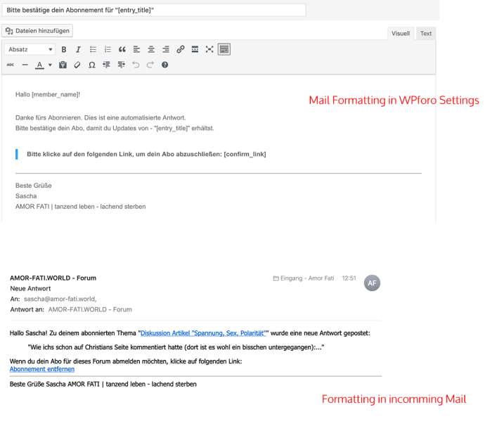
Imagine receiving an email where the subject line is in a large, bold, sans-serif font, the body text is in a small, serif font, and the call to action is in a completely different, italicized script font. This visual chaos makes it difficult to quickly scan and understand the key information. The inconsistent use of bold, italics, and underlines further complicates matters, creating a visually unappealing and unprofessional experience for the recipient.
Best Practices for Consistent Font Usage
Maintaining consistency across your email’s font sizes and styles is essential for a positive user experience. This involves careful selection and application of fonts to headings, body text, and calls to action. Using a limited number of fonts (ideally two – one for headings and one for body text) prevents visual clutter and ensures a cohesive look.
For headings, choose a clear and easily readable font in a larger size (e.g., 18-24px) to immediately grab the reader’s attention. For body text, opt for a legible font in a smaller size (e.g., 14-16px) that allows for comfortable reading. Calls to action should be visually distinct but still maintain harmony with the overall font scheme, perhaps using a slightly bolder weight or a contrasting color.
HTML Email Template Demonstrating Consistent Font Usage
Below is a simple HTML table structure illustrating the difference between inconsistent and consistent font usage. Note that the actual visual appearance will depend on the recipient’s email client.
| Inconsistent Example | Consistent Example |
|---|---|
|
This is some text. This is important! And this is something else. Click here! |
This is some text. This is important! This is something else. Click here! |
Impact of Inconsistent Fonts on Brand Image and Professionalism
Inconsistent font choices directly impact your brand’s perceived professionalism and credibility. A visually cluttered and disorganized email suggests a lack of attention to detail and can damage your brand’s reputation. Conversely, a well-designed email with consistent fonts projects a professional and polished image, reinforcing trust and credibility with your audience. Consider established brands like Apple or Google; their email communications consistently use a limited, carefully chosen set of fonts, reflecting their overall brand identity and fostering recognition.
Improper Use of Images and Attachments

Oversized images and numerous attachments are common culprits behind email delivery failures and frustrating user experiences. These issues can range from slow loading times to outright email rejection by mail servers. Understanding how to optimize images and manage attachments is crucial for ensuring your emails reach their intended recipients and provide a positive user experience.
Image Optimization for Email Delivery
Optimizing images for email involves reducing file size without significantly compromising visual quality. This is achieved through careful selection of image format, resizing, and compression. Using excessively large images can lead to slow loading times, impacting the user experience and potentially causing email clients to block or truncate the email content. Additionally, large attachments can exceed server limits, resulting in delivery failures.
Choosing the right image format is critical. JPEG is generally best for photographs, offering a good balance between file size and quality. PNG is ideal for images with sharp lines and text, preserving transparency. GIF is suitable for animated images and images with limited colors.
Here are some HTML code examples demonstrating image optimization:
Example 1 (Using a smaller image):
<img src="optimized_image.jpg" alt="Description of image" width="600" height="400">
This example uses a pre-optimized image (“optimized_image.jpg”) and specifies the width and height attributes to control the display size. The ‘alt’ attribute provides alternative text for screen readers and users with images disabled.
Example 2 (Using inline CSS for resizing):
<img src="original_image.jpg" alt="Description of image" style="width:600px; height:400px;">
This example resizes the original image using inline CSS. While functional, using CSS classes for styling is generally preferred for better maintainability.
Image Format Comparison
| Image Format | File Size | Quality |
|---|---|---|
| JPG | Generally smaller; lossy compression | Good for photographs; some quality loss during compression |
| PNG | Generally larger than JPG; lossless compression | Excellent for graphics with sharp lines and text; preserves transparency |
| GIF | Small file size; limited color palette | Suitable for animations and images with few colors; lossless compression |
Best practices generally favor using JPG for photographs and PNG for graphics. GIF should be reserved for animations or situations where a limited color palette is acceptable.
Attaching Files Optimally
Before attaching files, always compress large files using archiving tools like 7-Zip or WinRAR. This significantly reduces file size without data loss. Furthermore, use descriptive and concise filenames. Avoid using special characters or spaces in filenames to prevent delivery issues.
Here’s a step-by-step procedure:
- Compress large files using a compression tool.
- Rename files using descriptive and concise names (e.g., “ProjectReport_Final.pdf” instead of “My Document 1.docx”).
- Select the compressed files in your email client.
- Attach the files to your email.
- Review the total size of attachments to ensure they are within acceptable limits for your email provider.
Layout and Spacing Issues

Email layout significantly impacts readability and the overall impression on the recipient. Poorly formatted emails with inconsistent spacing, broken text flow, or inappropriate line breaks can make your message difficult to understand and appear unprofessional. Conversely, well-structured emails with clean layouts enhance readability and create a positive user experience. This section will explore common layout problems and provide solutions for creating visually appealing and responsive emails.
Understanding Common Layout Problems
Uneven spacing, broken text flow, and the misuse of line breaks are prevalent issues in email design. Uneven spacing can result from inconsistent use of paragraph tags, improper indentation, or the overuse of hard returns. Broken text flow occurs when text wraps awkwardly, causing visual clutter and making the email hard to read, often due to neglecting responsive design considerations. Excessive or inappropriate line breaks disrupt the natural flow of the text and make the email appear messy. These issues can be mitigated through careful planning and the use of appropriate HTML and CSS techniques.
Creating Visually Appealing Layouts with HTML Tables
HTML tables offer a robust and reliable method for structuring email content, particularly for creating responsive layouts across various email clients. The following example demonstrates how to use a 4-column table to compare a poorly formatted email section with an improved version.
| Poor Layout Example | Improved Layout Example | Explanation of Changes | HTML Code Snippet |
|---|---|---|---|
|
This is some text. It’s poorly formatted and has inconsistent spacing. And another line with too much space. |
This is some text, now with consistent spacing and improved readability. Another line of text, flowing naturally. |
Removed unnecessary line breaks and used consistent paragraph spacing for better visual flow. | <table><tr><td><p>This is some text, now with consistent spacing and improved readability. Another line of text, flowing naturally.</p></td></tr></table> |
Managing Whitespace for Readability
Whitespace, the empty space between text and elements, is crucial for readability and visual appeal. Excessive whitespace can make the email feel sparse and unfocused, while insufficient whitespace can lead to cramped and cluttered content. A balanced approach involves using appropriate paragraph spacing, margins, and padding to create a clean and easy-to-read layout. This often involves a careful balance between visual appeal and the need for brevity in email communication. For example, ensuring sufficient padding around images and text blocks prevents elements from feeling crowded.
Using CSS for Spacing and Alignment
CSS provides precise control over spacing and alignment within emails. Using CSS allows for consistent styling across different email clients and ensures a cleaner, more professional look. The following examples show how CSS can be used to control padding, margins, and text alignment.
Example 1: Adding padding around an image:
<img src="image.jpg" style="padding: 10px;">
Example 2: Centering text within a table cell:
<td style="text-align: center;">Centered Text</td>
Example 3: Controlling paragraph spacing:
<p style="margin-bottom: 15px;">Paragraph with custom bottom margin</p>
Last Recap

Mastering email formatting is crucial for effective communication. By implementing the strategies Artikeld—maintaining consistent font styles and sizes, and optimizing images and attachments—you can ensure your emails are professional, visually appealing, and deliver flawlessly. Remember, a well-formatted email reflects positively on your brand and enhances the recipient’s experience, leading to improved engagement and results. Take the time to refine your email design; it’s an investment in your communication success.